My expectations of this course were to learn and be exposed to a variety of different styles and techniques that progressed through the history of art. I feel that art is anything that someone has achieved true mastery in. This can be with artworks, music, even tile work. I feel that this class did a great job in showing me many different of artistic styles in the field of art.
My favorite artist is still Van Gogh however I got to see many different other works from other artists that I enjoy. For me I prefer modern art in general no matter who the artist is. During this class I got to see works of modern art created by many different artists.
This class was another great online experience. Each of the assignments were well defined and organized in each module. For me a clear outline of the expected work is key to a successful grade. This was done very well in my opinion! Being able to turn in items early was also a big help! I am continuing on for my Master’s degree and my program is offered 100% online. I will be finishing up my education entirely in an online environment.
Thursday, May 12, 2011
Tuesday, May 10, 2011
Week 16 Video Blog
Greenberg on Art Criticism
I enjoyed that in this video Greenberg discussed that even many years ago that the stereo type was that money and fame would alleviate all of life’s problems. However he went on to mention that this time was around avant-garde and meant that if one was successful they were typically not very liked. This was the same for artists, musicians, and sculptors alike. What I really liked was his quote “you don’t ask anything of art except to be good.” I feel that this video relates because he spoke about mainstream art and I feel that my project which focuses on nature is about as mainstream as it gets.
Greenberg on Pollock
Greenberg began to explain how he was told that Pollock was an artist with great talent and that he would be a great painter. With much skepticism he dismissed the idea however after 1947 he began to see that he was a talented man. He also felt that the demise of the easel paintings around this time as well. I didn’t realize there was specific time that this idea took place. This related to my project because from the size of some of the works I included I know they were too large to have been painted on a standard easel.
An Introduction to the Italian Renaissance
Before the collapse of the Roman Empire the culture was shifted to the east which was then called the Byzantine Empire. These artists were required to only paint religious figures as it was not accepted to paint men and women who were god’s creation. Giotto’s work revived the representation of humans as well as using perspective by using architecture and nature landscapes. This related to my project because I chose landscapes as a theme. In many of the works I chose however, the element of perspective were not identifiable.
The Critics
Critic’s jobs are to continuously teach and get people to start thinking in a fresh way. Books and other media are designed to give people things to talk about as well as educate and provoke. If these artists can provoke thinking then they have done a good job. Critics also are key as reviewers to TV and movies. This video didn’t seem to relate much to my project because we had to write on what was evident in the images and not our personal opinion of the work.
The Colonial Encounter
During the early 1900’s travel began to become popular. Tourism and pleasure were the reason for the development of many cities. The introduction of postcards allowed for outside cultures to become familiar with Arab women. There was a large emphasis on physical attributes in relation to intelligence. These images fell in between scientific and erotic themes. But since they called them science there was a refusal to the sexuality behind them. This video had nothing to do with my project as it discussed non-western art and culture and not at all landscapes.
Jackson Pollock
The point of Pollock’s work is to try to discover a complete other figure. His works express something different then works of the past. Instead of distinct figures he broke the mold and chose to drive further past abstraction. The viewer would now take the colors, shapes, and lines as the key elements of the work. He attempted to redeploy the standard of typical art. Ambition and feeling is always immediately clear in these types of paintings. Abstract art did not fit into the theme of my project either. I think it would be very hard to represent a landscape type theme using abstract art.
These videos were a nice change from the chapter reading at the end of the semester. Each of the videos covered topics in great depth and also shared many interviews and examples for each themed video. I always find it more enjoyable and more interesting to watch these videos then reading out of the chapter. Overall another great set of videos
Saturday, May 7, 2011
Project 4 Reflection
I chose to use nature as the theme for my project. I feel that some of the most beautiful things have been forned without human interaction. I really enjoyed this project since we were give a choice on what we wanted to do it on. This made it more enjoyable for me personally. I also enjoyed looking through the amazing collection of art on ArtStor! This was a great resource. I look forward to seeing what other students have put together as well.
Wednesday, April 27, 2011
Week 14 & 15 Video Blog Review
Lowbrow art is another style of art which I was never aware of. It is usually defined as distasteful however I think that with the rest of art it is all about interpretation. I also learned that even mechanics were involved in the lowbrow art movement by applying the style to automobiles. McCarthyism was also a topic displayed in this style of art. This doesn’t relate to my initial choice for the art project however I think that I would enjoy learning more about this. This was actually one of my favorite videos because it had many interviews with different artists that talked about a lot of the history of this style as well as many examples of different works.
Displaying Modern Art: The Tate Approach
Modern art is also one of my favorite styles of art and I feel that Generation Y also takes a view on this. I found it fascinating that they converted a power station into an art gallery. The success of the Tate Modern exhibit was instantaneous. A million people visited the museum in just 40 days. It quickly became the most successful modern art museum of all time. A majority of the art here is Western European and North American which are surrealists and pop works. There is also a very little respect to women artists. This style of art brought the works off of the walls and turned museums into loud and noisy environments. I have always been fond of modern art and thought about using this as a topic for my project however I am still undecided. I liked how this video explored multiple museums and showed how modern art changed the style and layouts of typical displays.
Bones of Contention: Native American Archaeology
This video was very interesting as it discussed a type of art than what is typical. It began by showing what looked to be a warehouse full of remains of Native Americans. Archaeologists are individuals that study the remains of ancient individuals. In 1976 Iowa passed a bill to protect burial grounds and many states quickly followed. Not only did individual archeologists get harmed by such laws however these laws then took aim at museums that housed remains. I feel that these kinds of studies are necessary to the field of science and our history. This video did not relate to my project at all because I never thought about the study of remains or by choosing a Native American theme. The video was very good as it showed how history had changed over time with the study. I enjoyed this video because it was on a subject that I knew nothing about.
George Eastman House
I liked this video because it related to both the studies and subject of this class as well as related to Rochester which is very close to Buffalo. He was the founder of Kodak as well as the first motion picture. He also created the first affordable camera for the masses and this would change the world forever. I think that this would be a great place to visit to see the amazing collection of pictures and equipment that paved the way to what we now know as pictures and photography. I really enjoyed how the video walked through the history of the equipment and the photographs and that the Eastman House has many items which are related. Over the past few years I have taken a great interest in photography. I bought a DSLR camera which saves on developing costs and allows me to take infinite pictures. I think that I have enough pictures of a specific theme that I could use my own collection for this art project but photography wasn’t my planed theme for project 4. This might change over the next couple of days though.
Friday, April 22, 2011
Week 13 - Video Blog
The Power of Art
I chose this video because I feel that art can be very a powerful and emotional. I liked the opening statement “can art change your life?” This statement was true for Rothko because he became so absorbed in his work that he committed suicide. I also learned that Seagram had Rothko decorate their first headquarters building. This relates to the text because it further shows examples of abstract art and how it affected people’s human emotion.
Uncertainty: Modernity and Art
I chose this video because I wanted to learn more about why the video was titled as Uncertainty. This video explains how the time of modern art after the Industrial Revolution and how it represents current society. After this period of time, life changed forever. Art has moved from the margins of social life to the center. What makes modern art interesting is that it continues to evolve around modern society. Modernism was an issue that we read about in the book this week. It was nice to see some video footage of some art galleries and types of art they housed.
Andy Warhol: Images of an Image
I picked this video because I wanted to further my knowledge of Warhol. I knew that he was famous for the Campbell’s soup image however I wanted to see what other kinds of works he created. He started his work being employed by advertising companies and magazines. I was interested to learn that he also did work for Coca Cola. The series of Marilyn Monroe silkscreens he created were also interesting. His style of repeating the same image is evident in the majority of his works.
The Art of Henry Moore
I chose to watch this video because I never have heard of Henry Moore and wanted to see what kinds of works he created and if I could recognize any of them. It was evident that Moore loved art very much. He stated that he drew anywhere and anything. He focused on drawing animals, figures of people, and trees. The figure was always important to him as it was a representation of a living thing. He put a large focus on his education and attended two art schools. He enjoyed Mexican art and it formed his views of carving.
Each of the videos were very informational and expanded on the reading in the chapters we read. I really enjoyed the narration in the first video; he has been in other videos we have watched and has a good style. I enjoy seeing more examples of the types of works while having the video narrated. This has always been an easier style for me.
Sunday, April 17, 2011
Gallery Visit #2
Castellani Art Museum at Niagara University
Step 1: The Exhibition
Questions about the exhibit:
1. What is the title of the exhibit?
There were 4 main exhibits on display at this museum. Betty Gold: Edge, Color, Movement, Scott Bye: Method to My Madness, Through Polish-American Eyes, and an exhibit on the Underground Railroad.
2. What is the theme of the exhibition?
The Betty Gold exhibition was a collection of serigraphs whose theme used brilliant color and strong directional objects such as arrows. There were approximately 50 of these 26x20 inch works on display and were displayed in their own room.
The Through Polish-American Eyes exhibit was also in its own room and included drawing that represented the life of Polish tradition around Christmas time. There were many drawings as well as a few displays of what a traditional Polish Christmas meal looked like.
Scott Bye’s exhibition included all structures that were composed of abstract items. He also had a segregated part of the museum for his works. The artists used a variety of other individuals disregarded items to portray his ideas of health, politics, and the economy.
The Underground Railroad focused on the history of the movement that Niagara Falls is well known for. There were many displays that explained how the slaves secretly traveled from the southern states to Canada. There was also a display of the arm and leg shackles that were used during the time.
Step 2: The Gallery
Questions about the physical space:
1. What type of lighting is used?
Most of the exhibits used track lighting to illuminate each of the art works. All of the rooms were very well lit. Scott Bye’s exhibit also used spotlights to light up his sculptures.
2. What colors are used on the walls?
The majority of the museum’s walls were painted white. There was a very large entrance room which included a massive orange wall. In the Polish-American display 3 of the walls were painted white while the other wall was painted a very vivid red color and complemented the black and white works that were on that wall. The Underground Railroad exhibit used an earthy green color scheme on all of the walls.
3. What materials are used in the interior architecture of the space?
The entire museum appeared to be just painted drywall with each of the art works attached. This museum was only one floor and it had a tiled white floor. This style seemed to make each of the art works be the focus of the viewer’s eye.
4. How is the movement of the viewer through the gallery space?
Once entering the main room of the museum there is a room immediately to the right which leads the viewer to a start. After looking at all of the artworks the viewer moves into the next of three rooms. At this point the viewer moves through the back of the museum and into another group of three rooms coming back towards the front of the gallery. The viewer moves through in an upside down U shape.
Step 3: The Artwork
Questions about the artwork:
1. How are the artworks organized?
The majority of the artworks are all grouped into their own exhibits. Each room is a different style of artworks which was very interesting.
2. How are the artworks similar?
Each of the exhibits included very similar types of works the Betty Gold exhibition displayed many of the same size works with different combinations of arrows and vivid colors. Bye’s exhibition included different structures of random objects which forced the viewer to break down each part of the work piece by piece.
3. How are the artworks different?
There were a variety of different kinds of artworks on display. Some were oil on canvas, there were some photographs, colleges, and installations. Each of the exhibitions had their own theme.
4. How are the artworks framed?
A majority of the works of art did not have any type of frame. Some of the other works included very bold thick gold frames which looked like frames from a much older style of art. Many of the works appeared framed because the artist left a small border around the works using the absence of color on the medium used.
5. How are the artworks identified and labeled?
Each of the artworks were identified using small white plaques like in the Albright Knox gallery. They depicted the artists and title of each work as well as a short description of the materials used.
6. What is the proximity of the artwork to each other?
For the most part the entire gallery used about a one foot spacing between each of the art works and had them at about eye level to the viewers. There were many different works on display and made the gallery look full but not over crowded. There appeared to be equal distance between the floor and ceiling between each of the works.
Art Criticism
Artist: Betty Gold
Title of work: The Apex of Being from the Arrows Portfolio
Media: Serigraph
Date: 1970
Size: 20x26”
Source of picture (URL):
http://www.castellaniartmuseum.org/assets/Uploads/_resampled/SetWidth300-Gold-constant-contact-2.jpg

1. Description – The artist used a purple background for the entire image and included 2 arrows that meet in the middle of the work in two different colors. The arrow heads are outlined in white.
2. Formal analysis – The artist uses a variety of contrasting colors to make the arrows “pop” out. She also uses only straight lines to separate each part of the work. This piece is also symmetrical.
3. Bracketing - The arrows remind me of being directed in some way. I think that it is interesting that both of the arrows meet each other and point in opposite directions.
4. Interpretation – I think that the artists was trying to say that in any activity there is always a force from different directions and that only when they can equally meet in the middle can the activity be completed.
Artist: Scott Bye
Title of work: RV
Media: Cedar, grocery cart, wood
Date: 2008
Size: 36x36x72”
Source of picture (URL): http://www.sculpturebyescott.com/sculpture.html

1. Description – The artist used a combination of a shopping cart and pieces of wood to enclose the basket of the shopping cart and make it look like a house.
2. Formal analysis – The artist uses the cart as the base of his work and used pieces of wood to make the cart appear to be a dwelling. There are stairs leading up to what appears to be a door and a roof made from cedar shingles. The use of color makes the red cart stand out from the natural colors of the wood.
3. Bracketing – The dwelling in this piece reminded me of a small tree house. It was put together very plainly without any finishing of the wood.
4. Interpretation – I think that the artist was trying to express the idea that homeless individuals use a shopping in a way like an RV. It travels along with them and provides storage and represents their home.
Artist: Jed Jackson
Title of work: Courage My Friend the Devil and Death
Media: oil on wood
Date: 1987
Size: unknown
Source of picture (URL): http://www.castellaniartmuseum.org/castellani-art-museum-of-niagara-university-presents-jed-30-years-of-painting-by-jed-jackson/

1. Description – The artist uses mainly blacks in this piece of work to give a feeling of dark subject matter. A man and a woman stand over a man who is down on the ground. The man on the ground has his right hand extended as if he is saying stop. This man’s face is much more pale then the other 2 characters.
2. Formal analysis – Jackson uses a majority of dark colors to establish a value that the topic is dark and not pleasing. The characters are placed very close to each other and leads to a sense of compacted space. The proportion seems an unrealistic to the trees in the background but the people are proportionate.
3. Bracketing/Interpretation – Initially I felt that the subject matter was very dark. I like to interpret the art before looking at the title that the artist gave it. It seemed that the two standing individuals were connected in some way. The expressions on their face show concern but not sadness.
What did you think of visiting the Gallery and purposefully looking at the exhibition from a different perspective - the physical space, the architecture, theme, etc.?
This gallery is located in Niagara Falls where I have lived my entire life but never visited. I enjoyed the visit and was surprised by the extensive collection that they housed. I felt that they layout was very good and guided its guests in a very clear manner around the entire gallery from entrance to exit. The architecture was very clean and simple and really focused on the artwork and not the building itself. Each room was very good size and the main room was extremely large and housed some of the biggest works. I will be making another trip back in the near future.
Friday, April 15, 2011
Week 12 Video Blog Review
I chose the Matisse and Picasso video because I wanted to learn more about Picasso. He is one of the most well-known artists of all time. Mention Picasso and almost everyone makes the association that he was a famous artists. I also chose this because I was intrigued by the Picasso display at the Albright Knox Museum. A painting represents the idea of things during the Cubists idealism. In 1912 he created the first college which was done in oil and was the leader of the Cubist movement. This relates to the readings because Cubism was one of the topics I discussed in the forum posting.
I watched the Dada and Surrealism video because I felt that it was a very influential period of time which reacted to WWI. I think that this period of time since there was a push to develop art that represented life yet was very vague. The artists used a lack of detail in order to create a different type of representation to the viewers. Many of the works allowed the viewer to bypass easy traditional associations and forced them to think harder about the piece. The Dada movement was also a large part of the chapter 21 material.
The Expressionism video further expanded on the ideas in the chapter of artists creating work that emphasized emotional ideas by using the element of color. Kirchner’s works are very pictorial and are designed to express sensation rather than specific objects. I think that art should stimulate emotion and that the inability to do so doesn’t allow a work to be considered art. Expressionism is also one of the topics of the chapter we read. These works were created around the time my grandmother was born which I why I found a connection with them.
Mystical North: Spanish Art from the 19th Century was another of the videos that I chose to watch. This was because it included more of Picasso’s work as well as other works of art that were provocative which it another reason for creating art. Dali is an artist that gave us the idea that dreams could be represented in works of art. He was a very controversial artist during the 1930s. This was during the time of communism and fascist ideas. One of arts main ideas is to represent history and this is what the video makes clear to the viewer.
I prefer to watch these videos because I feel that they further explain what the text cannot represent. There are many more examples of each topic in the video and I like how the narrator breaks down some of the works of art to show each of the elements and what the artist was trying to represent. There is much more information in each of the videos then in the reading in the text. The textbook author and the narrators of the videos also have two different styles of explanation which helps comprehension of the topics.
Friday, March 25, 2011
Week 9 Video Blog
The Mind of the Renaissance
I chose this video to learn more about da Vinci. Complete artists as the video explains, are artists that can move from one discipline to another such as art to music. His quick thoughts often led him to examine the philosophical aspects than the technical aspects. At the age of 20 Leonardo was accepted into the Painters Guild.
I chose this video to learn more about da Vinci. Complete artists as the video explains, are artists that can move from one discipline to another such as art to music. His quick thoughts often led him to examine the philosophical aspects than the technical aspects. At the age of 20 Leonardo was accepted into the Painters Guild.
The Power of Art: Caravaggio
Caravaggio was quite a different type of Rome than the typical stereotype. This part of Rome was more of slum area where soldiers, artists, and merchants tried to make ends meet. These individuals lived day to day doing whatever possible to stay alive. They lived by the motto, “without hope without fear.” I chose this video to see what Caravaggio was.
Caravaggio was quite a different type of Rome than the typical stereotype. This part of Rome was more of slum area where soldiers, artists, and merchants tried to make ends meet. These individuals lived day to day doing whatever possible to stay alive. They lived by the motto, “without hope without fear.” I chose this video to see what Caravaggio was.
La Primavera
This video explained the many different elements that were used in this work of art. He used many different types of flowers in his work which don’t align to one particular season. There are so many different flowers in this work that one individual has set out to try to prove meaning to each of them. I find this almost an impossible task as there is no way to really understand what the artist was trying to say.
This video explained the many different elements that were used in this work of art. He used many different types of flowers in his work which don’t align to one particular season. There are so many different flowers in this work that one individual has set out to try to prove meaning to each of them. I find this almost an impossible task as there is no way to really understand what the artist was trying to say.
The Nightwatch
What I learned in this video is that over time parts of this painting were lost. These areas of loss were around the edges. Because of this the painting has lost some of its power and meaning. Over time the painting has darkened due to the varnish. Even the name Nightwatch was given much later than the actual composition.
What I learned in this video is that over time parts of this painting were lost. These areas of loss were around the edges. Because of this the painting has lost some of its power and meaning. Over time the painting has darkened due to the varnish. Even the name Nightwatch was given much later than the actual composition.
Each of the videos further expand ideas that were talked about in the text. La Primavera and The Nightwatch are very thorough videos that really get in depth about each of the two works of art. I also learned how the changing of art over time due to discoloration and even physical damange can be a large impact on how the work is interpreted. I thought that each of the videos I watched were very good and really expanded on the textbook readings.
Thursday, March 24, 2011
Week 9 - Exploring Line

I thought that using my hand for subject matter for this drawing was an interesting idea. I don’t think I would have ever thought to try this. I selected a pencil because I thought that the charcoal would be harder to work with and that I might have smeared it since operating with my non dominant hand in this type of process is foreign to me. I do not feel that I have much of an artistic ability when it comes to drawing or creating art in general but I was interested in how different drawing with my non dominant hand felt. I try to use my non dominant hand for daily activities just to be used to it. I think with some practice I could get a better grasp of this skill.
Friday, March 18, 2011
Week 8 Video Blog
From the More Human than Human video explained how our hunter and gathering ancestors had a natural stimulation to parts of the body that they deemed most important. The work shown of the woman had no distinct face but her womanly parts were over exaggerated. These artists created works that showed what was most important to them including women and animals. This relates to the text because we read that the artists represented many animals in most of their art because they drove survival of humans.
Late Gothic Art and Architecture
In this video I learned that like gothic architecture the flying buttresses and such were integral pieces to sustain structural stability. In the Gothic churches the same concept applied but to the works of art that filled the inside of the church. There were representations of saints that were supposed to bring upon good luck finding an item lost, or a saint that would protect over safe travels. The video also explained how churches were focal points of societies, where people would come from any distance to take part in the service and gathering of parishioners. I chose this because my favorite time period is the late gothic period.
A World Inscribed: The Illuminated Manuscript
This video showed how during ancient times every book that was created was by hand. A single individual would spend countless hours transcribing a work or idea into a book. These individuals were the first publishers. An individual would devote his entire life to being a scribe. In the time it took to master this art the printing press was invented which was able to replace this profession. We have already read about how the printing press was able to produce books and documents without errors and in a much more efficient manner. I chose this video because of the title. Manuscripts were created by individuals and were one of a kind. Being able to handwrite a book with minimal errors is quite a task.
Beyond the Classical: Byzantine and Later Greek Art
The ideas of classical art were developed thousands of years before during the Renaissance. During the 19th century architects looked back at ideas and designs of classical Greece to develop what we know as the modern world. Of all created works architecture as some of the biggest impacts. The Renaissance was a rediscovery of Greek art. Just about every modern city has elements of Greek architecture. Usually banks and public buildings show these characteristics.
Each of the videos that I watched touched on many of the ideas that were discussed in chapters 14 and 15 as well as others chapters we have already read. Each of these videos furthered understanding of the chapter and proved to be good supporting material for the assigned reading.
Friday, March 11, 2011
Week 7 Video Reviews
Prairie Style
Wright talked about his houses being “organic.” His idea was that his houses should look like it they grew out of nature. It was also evident that these historic builds take every measure during renovations to keep the naturalistic ideas that were originally intended. During the renovations over 10,000 sq. ft. of cedar was replaced. Keeping in line with the green architecture the book touched on. Wright’s layout allowed the rooms to flow together as well as his use of picture windows to act as the joining force between outside and inside.
The Science of Design
I find it to be truly amazing the amount of work required to design a structure in terms of integrity, especially skyscrapers that the video talks about. I was not aware that there was an international regulation based on how far a building can sway in 8 seconds. If the force on the building it too great the inhabitants can be subject to motion sickness, the elevators can shut down, or even structural damage may occur.
Classical Architecture
This video explained that nations use buildings to represent their level of power and success to the rest of the world. The Queen’s house was an example of this idea. Her house was built to be perfectly square. The video also touched on the idea that the human body was the measure of all things. The body’s ratios and symmetries were displayed in Vitruvian Man by da Vinci. His drawing showed how the human body held similarities to design elements of square and circular shape.
Last Call for Planet Earth
I thought that it was an astonishing task for an architect to design a train station that was completely energy free. Only after countless hours of research could he have come up with that type of design. I think it is farfetched to accept this as a reality for every structure but with zero pollution it is a great start to changing the way we treat the environment.
The Prairie Style video was relational to the chapter because the author discussed about taking into consideration what building materials would be best fitting to a project. Each of Wright’s designs demonstrated a use of the nature that surrounded them. He also used a lot of wood flooring which also touches on the green architecture. The Classical Architecture video led us even more in depth than book’s examples. The Romans and Greeks designed the basic model for all construction. Our replications of it, to represent nation capitals and palaces for royalty are built this way because it shows power and domination. During the restoration of the Wright house all cedar was replaced and because it was a renewable resource it followed a green model.
The films were each very good as they added a further level of understanding to what the book talked about. I feel that between the videos and the book we got to see many examples for each of the main points discussed this week. I chose the “Last Call for Planet Earth” video because of the word sustainable. A recent trip to Disney in Florida taught me that we as humans can develop self-sustaining environments with the proper research. This idea will ultimately need to take off if we really want to make drastic change in how architecture is designed.
Friday, March 4, 2011
Video Review
Through the Eyes of the Sculptor
I learned from this video that the sculptor had to touch up the leaves of the building because over time they got built up with grime from the weather. It is true skill that the individuals making the restorations have to freehand everything. This relates to the text reading of the carving section on page 243. It was great to see the videos show an artist at work and how they make the skill seem so easy.
Glass and Ceramics
The glass section of the book explains how glass is heated to become molten allowing it to be shaped into almost any form. In the video it is interesting to actually see the glass blower at work in this craft. He can use many different tools to shape the glass which the text doesn’t really make as clear. I wasn’t aware that there was a butane version of glass sculpting as well. Glass even has the capability of being engraved. I really liked this video as I am fascinated with the art of glass blowing. I would like to try this at some point in my life. I always have a tendency to understand something better if I see in action and this video did exactly that.
Installation Art
Even the design of installations requires taking into effect each of the elements and principles of art. Even in the spots sculpture there are repeating shapes however different sizes which move the viewer’s eyes and even bodies through the exhibit. Examples are the best way that I can dissect a process. This video did a good job of showing the many possibilities are for installation art. From anything like a shovel to an arrary of plexiglass pieces.
Week 6 Peer Review
I posted comments for both Chris Wolf and Monica White's blogs. Both individuals found images that expressed each of the elements and principles of art. Most of the images chosen do include other elements as it is the combination of these elements that are required for masterful art.
I noticed in Monica's first image the view of a rocky beach and an embankment. I made a connection to almost a replicate of the view from my backyard. The hues of blues and murkiness of the water with the rocky beach made me really think this was "too close to home." A few images later and her example for line I saw something I truly recognized, the Toronto skyline. I almost selected the same image(colors, birds flying, clear day) for my example. Small world and amazing recognizable even in a distance learning class!
It seems like that either Chris or someone very close to him enjoys the outdoors and has traveled far from this area. Did the photographer take a ride in that helicopter? I also respected the fact he was involved with the CBP as I have a few friends that are Border Patrol Agents as well.
I think that these blogs are great because people seem to be honest with all of their comments without putting the creator down. I also find that is enjoyable to check out the others work with no sense of judgment in this type of class. I'm glad that others enjoyed my work by them posting their comments! Each of the images were very special to me and I am glad that someone else was able to enjoy them!
Sunday, February 27, 2011
Art Gallery Visit 1
Which artworks make an impact or impression on me? Why?


Zhan Wang’s “Urban Landscape, Buffalo” also made an impact on me because of the hometown relation to the work. Using the kitchen items to form the landscape was a very creative and outside the box idea of materials.

Which artworks do I feel a connection with? Why?


Which artworks would I like to know more about? Why?


“The Unentitled Graces” by Jess was another work of art that I found to be very interesting. The college is full of colors and ideas spread across the work. There seems no rhyme or reason to the placement of each idea that that is something that I enjoyed about it.

The oil on canvas “Janet” by Chuck Close made an impact on me not only because of the sheer size of the work but how up close smaller squares that make up the entire image wouldn’t look like much if only a small portion was shown to someone. However when each of the squares makes up the entire image the result of the woman’s face is very cool.

I also enjoyed Gary Simmons’s “D.C. Pavilion” which is oil paint and cold wax on canvas. I really enjoyed the larger pieces at the gallery and this made an impression on me due to the simplicity of the work. The building is alone on the canvas and the addition of white streaks upward makes the building look like it is on fire.

Zhan Wang’s “Urban Landscape, Buffalo” also made an impact on me because of the hometown relation to the work. Using the kitchen items to form the landscape was a very creative and outside the box idea of materials.

Which artworks do I feel a connection with? Why?
I felt a connection with Robert Longo’s “Hum” due to my involvement with technology on a daily basis for my job. It seemed to me that even back in 1988 Longo captured the idea of the kind of wildness technology has brought to us. I originally didn’t expect the art to have been created in 1988.

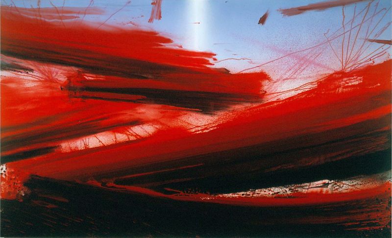
I also felt a connection with Barnaby Frunas’ “Untitled Flood”. Again I liked how massive the painting was standing 84” x 140” it was very massive. Red is one of my favorite colors and I thought that his red’s were extreamly vivid. I also felt a connection with the work because I saw it broken into pieces of red, with the black areas as a break separating calm with rougher times.
Sonja Braas’ “The Quiet of Dissolution” was also a piece that I felt connection with. I always try to see things from a different perspective than the norm and this aerial photo does just the same. It represents an entire area compressed into about a 5ft x 6ft print.

Which artworks would I like to know more about? Why?
I would like to know more about Clyfford Still’s “1957 –D” because there is always a reason behind the authors work. In this piece however the color scheme of yellows and blacks doesn’t show much of a clear idea to me as the viewer. I would like to know more about what he was trying to display.

Another work of art that peaked my interest was Sol LeWitt’s “Wall Drawing #1268” I would like to know how the multiple artists were able to work together to create a synchronous looking and extremely massive graphite display of shading.

“The Unentitled Graces” by Jess was another work of art that I found to be very interesting. The college is full of colors and ideas spread across the work. There seems no rhyme or reason to the placement of each idea that that is something that I enjoyed about it.

Saturday, February 26, 2011
Logo Design
Logo creation is a very fun yet difficult task to accomplish. I came up with TC’s PC’s as a name for my computer business back when I was young but never thought about a logo for it. This was the background for my design. I wanted to incorporate a computer monitor or a computer into the design which I did in the later ideas. The most important design discovery I made was to keep trying to come up with different designs. It may be hard not to replicate an idea but the more ideas or drafts the better the logo will be.
With the focus around logos I originally didn’t think about the design of the product packaging that the “Bottled Up” video brought into prospective. Having a distinct package is also a great idea in creating a product. From the PowerPoint I learned that the word logo in Greek actually stands for word which is what a logo represents in visual form.

With the focus around logos I originally didn’t think about the design of the product packaging that the “Bottled Up” video brought into prospective. Having a distinct package is also a great idea in creating a product. From the PowerPoint I learned that the word logo in Greek actually stands for word which is what a logo represents in visual form.

Saturday, February 19, 2011
Art Making Material Exploration
Both of the tasks were an interesting experience. I was surprised on how the charcoal reacted with plain paper. The color wheel was also a good insight into how colors react with each other using the subtractive method. From an IT side I now see how amazing this idea really is that a printer can represent so many different colors.
I thought it both of the medias were interesting to work with. I preferred the color wheel exercise. I enjoyed it due to the variety of colors. Black and white does have a specific purpose but I enjoy colorful art.
My most important discovery of this exercise was how important these techniques are. I have many clients that print photos and simply never realized how much went into the coding and programming of the printer software to be able to represent text and images correctly every time.
What I saw in the video was that again each skill that we possess develops with time and dedication. Both artists worked fluently and achieved consistent results. I expected the graphite to transfer to the covering sheet or smear but it did not. The color wheel video was interesting because it showed the differences between the shades of the 2 sets of primary colors.


Saturday, February 12, 2011
Elements of Art
A few years ago a friend of mine introduced me into the world of photography. I was instantly hooked and quickly went out and purchased a DSLR camera. Ever since, I found that I am brining the camera almost everywhere I go. I have taken an increased enjoyment in traveling as well in order to capture these unique images. Each of the images included hold a special place to me as I get to recall these amazing experiences from my past. Pictures have always had the ability to take me back to memories I thought I had forgotten about. I hope that some of these images do the same for you.
Friday, February 11, 2011
Week Three - Emotions and Color
We are born with natural reactions and perception to color. Color can make or break a mood; it can designate anger or happiness, and can even make you hungry. This is evident even with very young children. The popularity of research into the effects of emotion and mental states has grown at a rapid pace over the last few years. Color was even used as medical treatment within ancient Egyptian and Chinese civilizations. I am intrigued by the fact that even though colors have a large effect on mood, some colors represent opposite emotions. Red for example usually represents anger and violence but it also represents love. I find this fascinating because it’s all about personal interpretation.
In the first video, Color, I found that the impact of using bold colors like Van Gogh did to represent feelings of madness and anger. He did this by using deep reds and greens. He used an unnatural clash of colors to make the viewer see a definitive separation between the parts of the painting. In the second video, Goya who was a liberal progressive, used darkness to express his theory that human destiny has a tendency to destroy itself.
Friday, February 4, 2011
Week Two Video Review
“What is beautiful in itself is not this object or that one, but that which conveys their own nature.” This concept is what struck me most from the first video. It is very true because most artwork is not simply the object but the idea that the object came from. Most art is a representation of something that already existed, just exploring another side of it. Kant introduced that beauty is based on a feeling and that they are all subjective. There can be no exact measurement of what is beautiful because each interpreter sees things differently.
I believe that the Kant’s definition that the only things that can’t be beautified are things that are disgusting. These feelings are also inbred in us and bring upon other feelings of separation and distaste for the art. This was discussed in the Philosophy of the Arts.
The second video brings into light the ideas of neurobiology in combination with arts as that “symbolic forms are genetically encoded” into the human species. I find the field of neurobiology very fascinating and upon much research, there are many elements of human nature that have been with us since the first day we walked this Earth.
The videos relate to the text because they expand upon the ideas of aesthetics as well as human nature. After all, humans are the ones that have had the advanced development that enabled the creation and appreciation of art for thousands of years.
Both of the films were very good. Most of the ideas were discussed in the book very well, however some people enjoy viewing a presentation more than reading and I found this to be true for myself. I feel that being able to see and hear the speaker’s views on the subject were much more personal. It was clear that the speakers were compelled to speak on each of the topics and that they enjoyed doing so by encompassing quotes and ideas from specific artists and philosophers.
Tuesday, January 25, 2011
Gmail and Blogger Setup
The overall process of setting up my Gmail account and integration with Blogger was very easy. I have been a Gmail user since day one and think it is a great tool. The Blog already recognized my Gmail account and setup was easy.
I expect to gain an understanding of various types of artwork during the duration of this class. I would like to learn about the different styles and techniques that have been used to create these popular works of art over the years.
I have taken many online classes as I live a good ways from the BSC campus. I have always done fairly well however my biggest issue is that the professor must keep the schedule and expectations week to week very easy to understand. All of the issues I have seen in the past with online classes is that the teacher is not clear in the requirements each week. However this does not appear to be the case with this course. The Lessons tab is very well organized.
Subscribe to:
Posts (Atom)