Sunday, February 27, 2011

Art Gallery Visit 1

Which artworks make an impact or impression on me? Why?


The oil on canvas “Janet” by Chuck Close made an impact on me not only because of the sheer size of the work but how up close smaller squares that make up the entire image wouldn’t look like much if only a small portion was shown to someone. However when each of the squares makes up the entire image the result of the woman’s face is very cool.


I also enjoyed Gary Simmons’s “D.C. Pavilion” which is oil paint and cold wax on canvas. I really enjoyed the larger pieces at the gallery and this made an impression on me due to the simplicity of the work. The building is alone on the canvas and the addition of white streaks upward makes the building look like it is on fire.


Zhan Wang’s “Urban Landscape, Buffalo” also made an impact on me because of the hometown relation to the work. Using the kitchen items to form the landscape was a very creative and outside the box idea of materials.


Which artworks do I feel a connection with? Why?

I felt a connection with Robert Longo’s “Hum” due to my involvement with technology on a daily basis for my job. It seemed to me that even back in 1988 Longo captured the idea of the kind of wildness technology has brought to us. I originally didn’t expect the art to have been created in 1988.


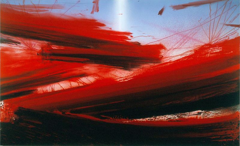
I also felt a connection with Barnaby Frunas’ “Untitled Flood”. Again I liked how massive the painting was standing 84” x 140” it was very massive. Red is one of my favorite colors and I thought that his red’s were extreamly vivid. I also felt a connection with the work because I saw it broken into pieces of red, with the black areas as a break separating calm with rougher times.


Sonja Braas’ “The Quiet of Dissolution” was also a piece that I felt connection with. I always try to see things from a different perspective than the norm and this aerial photo does just the same. It represents an entire area compressed into about a 5ft x 6ft print.


Which artworks would I like to know more about? Why?

I would like to know more about Clyfford Still’s “1957 –D” because there is always a reason behind the authors work. In this piece however the color scheme of yellows and blacks doesn’t show much of a clear idea to me as the viewer. I would like to know more about what he was trying to display.


Another work of art that peaked my interest was Sol LeWitt’s “Wall Drawing #1268” I would like to know how the multiple artists were able to work together to create a synchronous looking and extremely massive graphite display of shading.


“The Unentitled Graces” by Jess was another work of art that I found to be very interesting. The college is full of colors and ideas spread across the work. There seems no rhyme or reason to the placement of each idea that that is something that I enjoyed about it.


Saturday, February 26, 2011

Logo Design

Logo creation is a very fun yet difficult task to accomplish. I came up with TC’s PC’s as a name for my computer business back when I was young but never thought about a logo for it. This was the background for my design. I wanted to incorporate a computer monitor or a computer into the design which I did in the later ideas. The most important design discovery I made was to keep trying to come up with different designs. It may be hard not to replicate an idea but the more ideas or drafts the better the logo will be.


With the focus around logos I originally didn’t think about the design of the product packaging that the “Bottled Up” video brought into prospective. Having a distinct package is also a great idea in creating a product. From the PowerPoint I learned that the word logo in Greek actually stands for word which is what a logo represents in visual form.

Saturday, February 19, 2011

Art Making Material Exploration

Both of the tasks were an interesting experience. I was surprised on how the charcoal reacted with plain paper. The color wheel was also a good insight into how colors react with each other using the subtractive method. From an IT side I now see how amazing this idea really is that a printer can represent so many different colors.

I thought it both of the medias were interesting to work with. I preferred the color wheel exercise. I enjoyed it due to the variety of colors. Black and white does have a specific purpose but I enjoy colorful art.

My most important discovery of this exercise was how important these techniques are. I have many clients that print photos and simply never realized how much went into the coding and programming of the printer software to be able to represent text and images correctly every time.

What I saw in the video was that again each skill that we possess develops with time and dedication. Both artists worked fluently and achieved consistent results. I expected the graphite to transfer to the covering sheet or smear but it did not. The color wheel video was interesting because it showed the differences between the shades of the 2 sets of primary colors.


Saturday, February 12, 2011

Elements of Art


A few years ago a friend of mine introduced me into the world of photography. I was instantly hooked and quickly went out and purchased a DSLR camera. Ever since, I found that I am brining the camera almost everywhere I go. I have taken an increased enjoyment in traveling as well in order to capture these unique images. Each of the images included hold a special place to me as I get to recall these amazing experiences from my past. Pictures have always had the ability to take me back to memories I thought I had forgotten about. I hope that some of these images do the same for you.

Friday, February 11, 2011

Week Three - Emotions and Color

We are born with natural reactions and perception to color. Color can make or break a mood; it can designate anger or happiness, and can even make you hungry. This is evident even with very young children. The popularity of research into the effects of emotion and mental states has grown at a rapid pace over the last few years. Color was even used as medical treatment within ancient Egyptian and Chinese civilizations. I am intrigued by the fact that even though colors have a large effect on mood, some colors represent opposite emotions. Red for example usually represents anger and violence but it also represents love. I find this fascinating because it’s all about personal interpretation.
In the first video, Color, I found that the impact of using bold colors like Van Gogh did to represent feelings of madness and anger. He did this by using deep reds and greens. He used an unnatural clash of colors to make the viewer see a definitive separation between the parts of the painting. In the second video, Goya who was a liberal progressive, used darkness to express his theory that human destiny has a tendency to destroy itself.

Friday, February 4, 2011

Week Two Video Review


“What is beautiful in itself is not this object or that one, but that which conveys their own nature.” This concept is what struck me most from the first video. It is very true because most artwork is not simply the object but the idea that the object came from. Most art is a representation of something that already existed, just exploring another side of it. Kant introduced that beauty is based on a feeling and that they are all subjective. There can be no exact measurement of what is beautiful because each interpreter sees things differently.
I believe that the Kant’s definition that the only things that can’t be beautified are things that are disgusting. These feelings are also inbred in us and bring upon other feelings of separation and distaste for the art. This was discussed in the Philosophy of the Arts.
The second video brings into light the ideas of neurobiology in combination with arts as that “symbolic forms are genetically encoded” into the human species. I find the field of neurobiology very fascinating and upon much research, there are many elements of human nature that have been with us since the first day we walked this Earth.
The videos relate to the text because they expand upon the ideas of aesthetics as well as human nature. After all, humans are the ones that have had the advanced development that enabled the creation and appreciation of art for thousands of years.
Both of the films were very good. Most of the ideas were discussed in the book very well, however some people enjoy viewing a presentation more than reading and I found this to be true for myself. I feel that being able to see and hear the speaker’s views on the subject were much more personal. It was clear that the speakers were compelled to speak on each of the topics and that they enjoyed doing so by encompassing quotes and ideas from specific artists and philosophers.